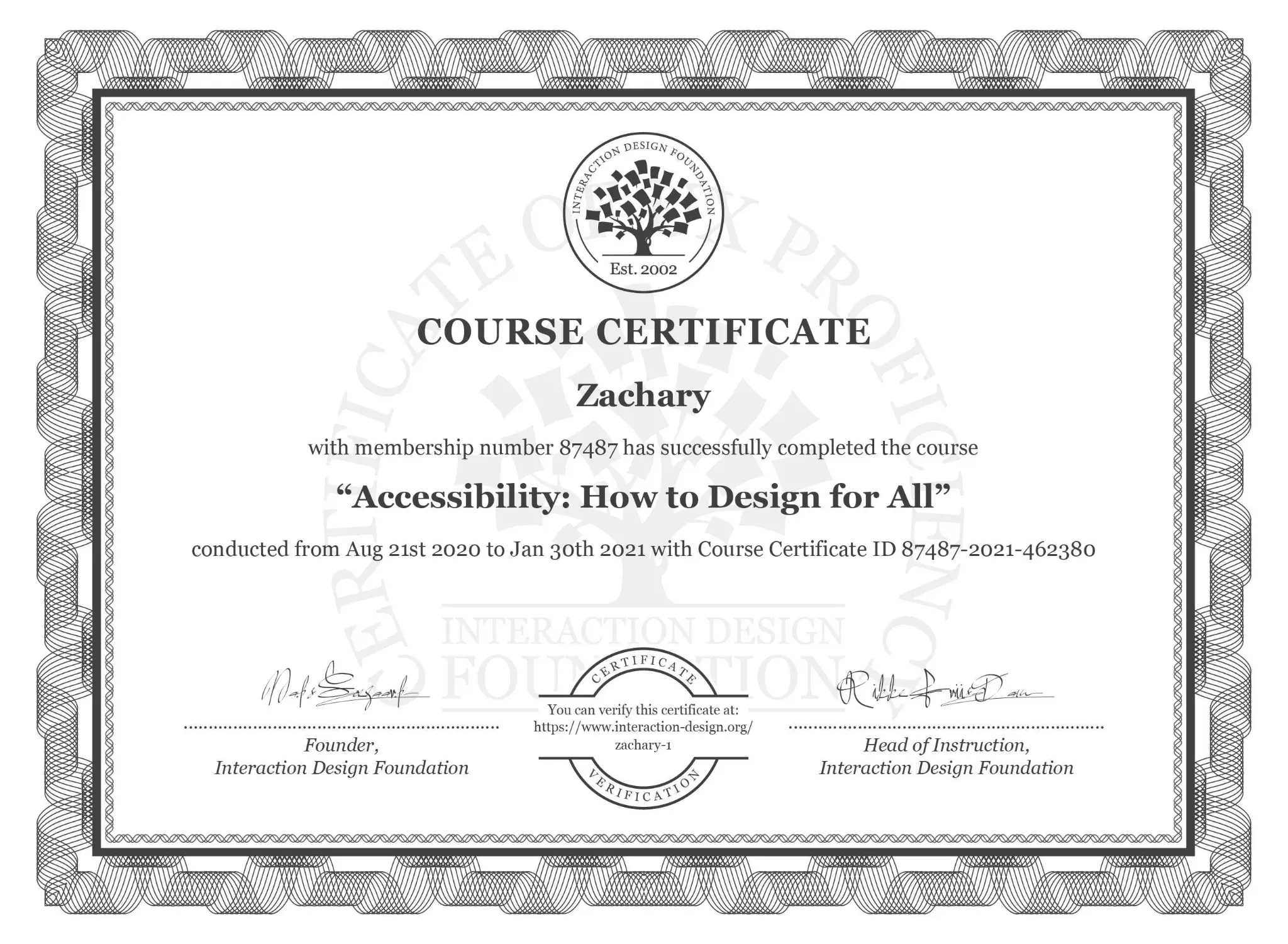
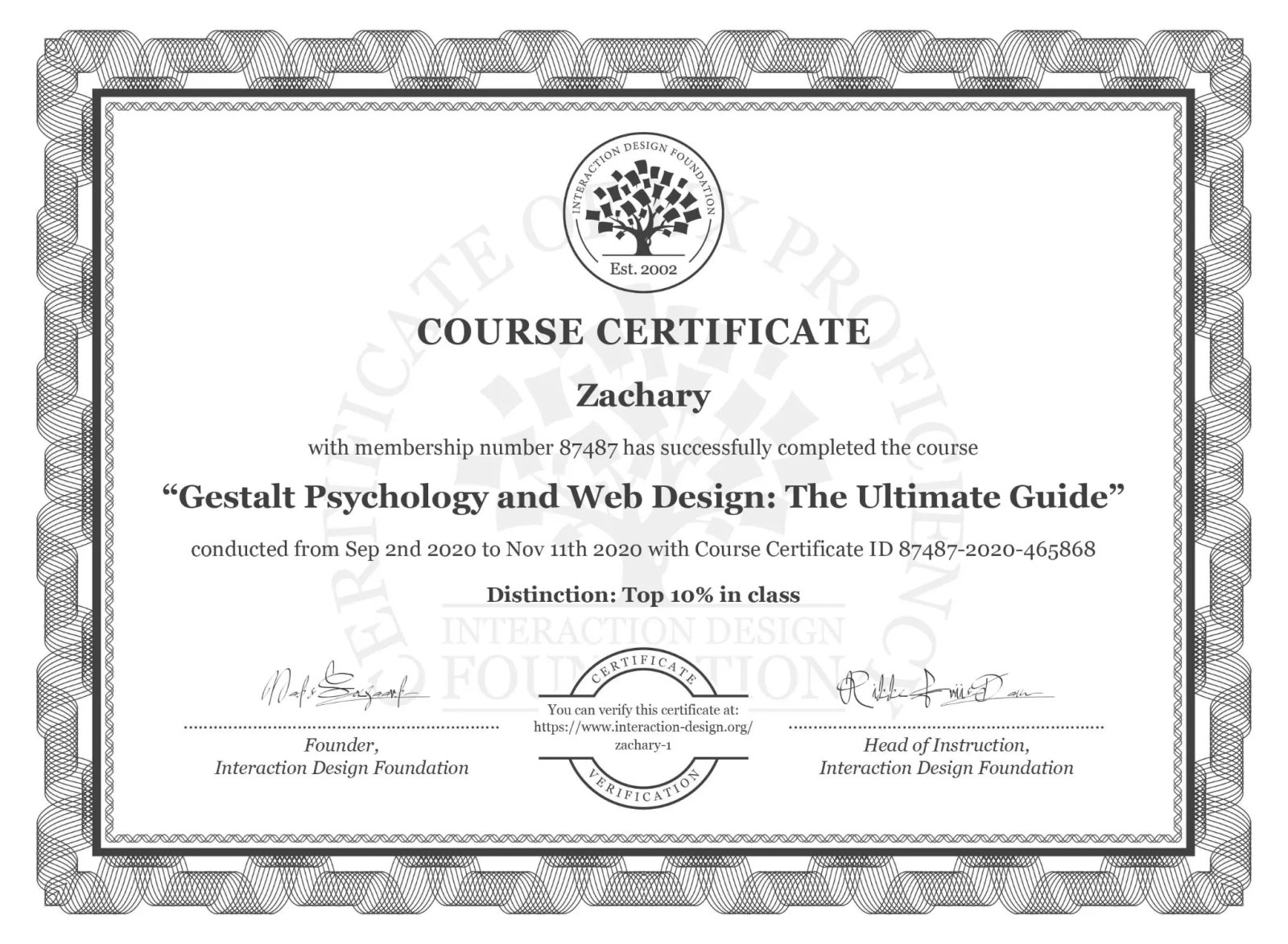
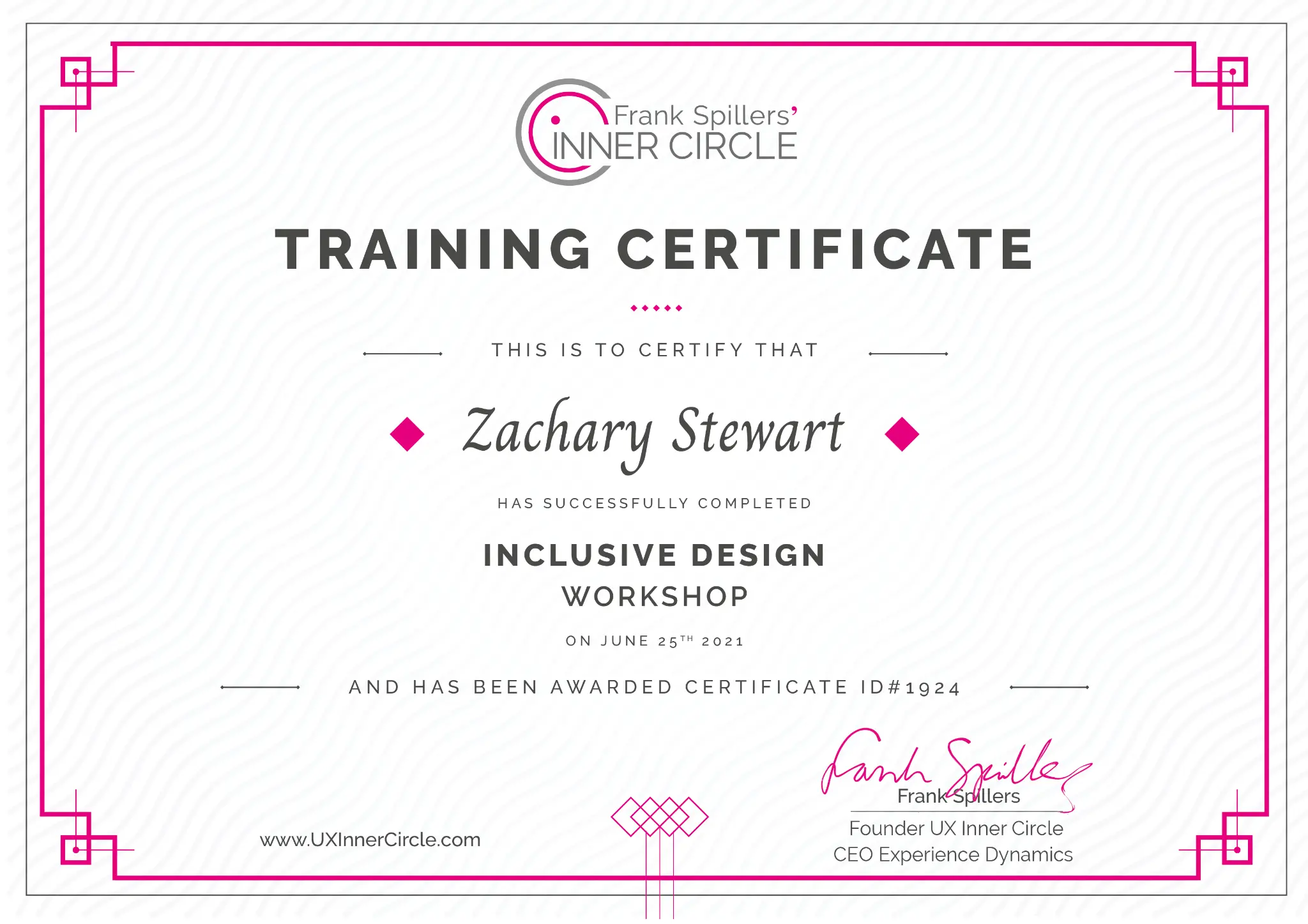
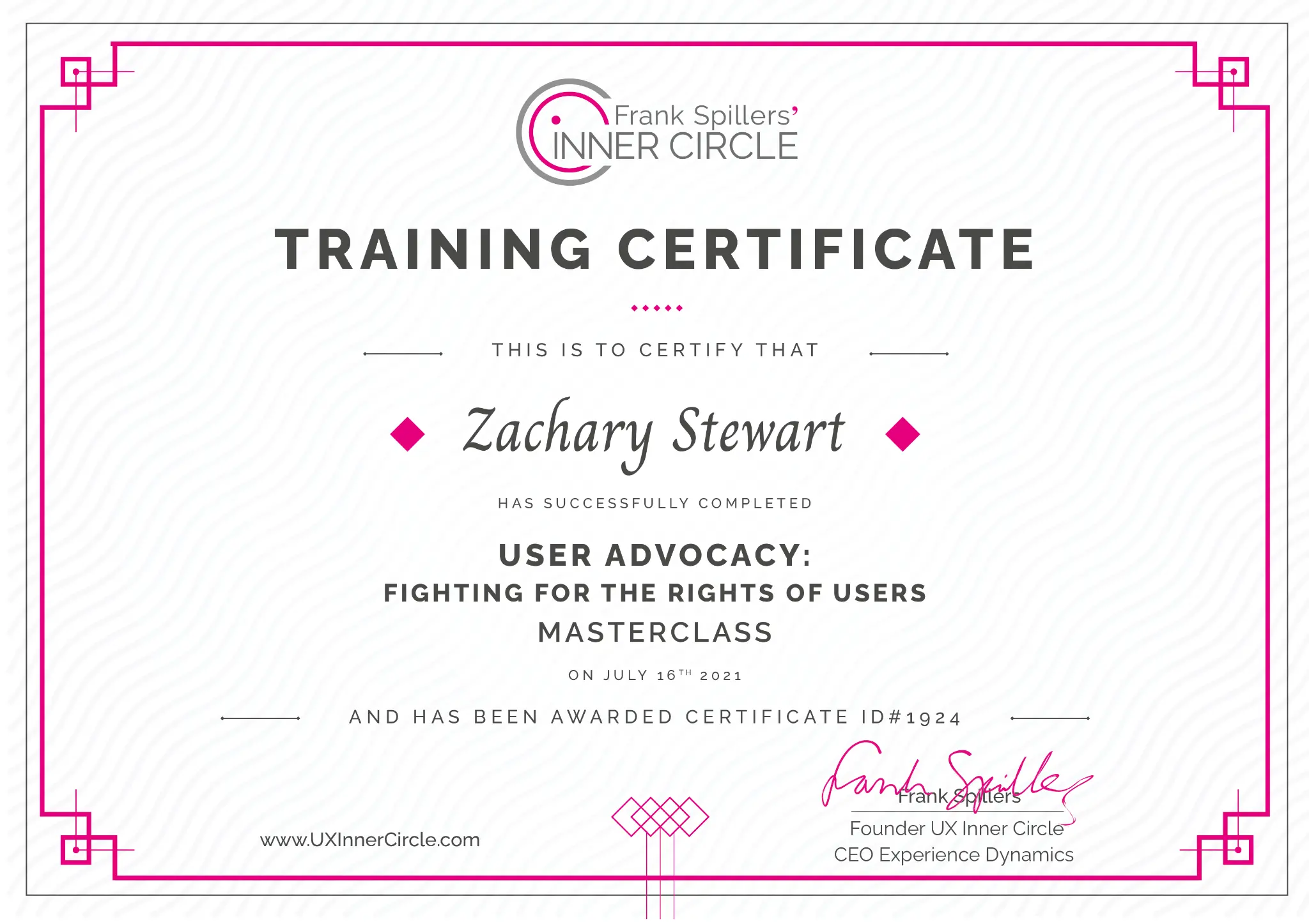
→5+ years of helping teams solve problems creatively
→2+ years driving conversational AI design decisions
→My work spans across healthcare, fintech, real estate, mobility tech, and more
Trusted At
Sector fluency
Same rigor, different rooms.
Pick a sector to see what I accomplished there.
Sector · Healthcare
Clinical trust, patient journeys, and the workflows in between.
Work spanning a top healthcare system in the American Southwest,
a global leader in diabetes care, and a global medical-device
company.
8
Patients, one at a time
Ran 1:1 moderated "walk-the-store" usability sessions for a
top healthcare system in the American Southwest, exposing
buried symptom checkers and unclear calls to action that
stalled appointment scheduling. Recommendations realigned the
information architecture to patient mental models via open
card sorting.
8
Clinicians on glucose dashboards
Led remote moderated tests with healthcare professionals on
continuous glucose monitoring dashboards for a global leader
in diabetes care. Uncovered a critical print limitation and
heavy reliance on hover states, then recommended a
one-stop-shop clinical dashboard with clearer visual urgency.
~60%
Sales friction cut on clinical AI
International interviews with 15 embryologists and lab
managers for a MedTech AI generative tooling company. Black-box
distrust and HIPAA anxiety reframed the roadmap toward a
conversational clinical partner and science-led enablement.
2
Service-line templates validated
Validated orthopedics and cancer-care page templates and
advised progressive disclosure for anxious patients,
establishing a persona-led navigation baseline for the
system's conversion engine.
Work spanning a Fortune 50 bank, a top-10 US retail bank, a
Fortune 100 financial services company, and a global gaming
platform's payments.
75
Applicants, three products, one diagnosis
Synthesized open-ended feedback across personal accounts,
credit cards, and business loans for a Fortune 50 bank.
Application length and repetitive questions emerged as the
top abandonment drivers, met with recommendations for time
estimates, pre-approval signals, and upfront transparency.
73%
IVR failure rate, quantified
Tree testing with 17 users measured a severe failure rate in
a top-10 US retail bank's phone-banking tree. A 30-person
open card sort then rebuilt the menu around "Self-Service"
and "Money Movement" clusters.
58 → 81
SUS jump on a rewards flow
Benchmarked a fintech rewards redemption flow, redesigned
against the data, and proved the lift with the same numbers
leadership trusted: task completion up 53%, redemption
drop-off down 47%.
24
Sessions with an AI dining concierge
Evaluated an AI restaurant-recommendation chatbot for a
Fortune 100 financial services company, catching natural
language failures around dates and mealtimes. Findings fed
directly into algorithmic optimization and clarifying
preference prompts.
2
Platforms mapped for regional payments
Mapped the full alternative-payment checkout on web and
mobile web for a global gaming platform's UK launch, keeping
a regulated regional integration frictionless.
Sector · AI & Emerging Tech
Human-in-the-loop research for products that think.
Work spanning a Fortune 50 technology company, a global
medical-device company, a Fortune 100 financial services company,
and Flyhomes.
87.5
SUS for AI-powered home search
Human-in-the-loop validation of an AI home search feature at
Flyhomes scored an A- on the System Usability Scale, with
dendrogram clustering revealing four distinct interaction
patterns that shaped the launch design.
23
Ambient AI trust gaps
Moderated 60-minute sessions across two studies for a Fortune
50 technology company: tablet out-of-box setup and hands-free
AI messaging on smart speakers. Surfaced how users misread
ambient AI status cues, underestimated always-listening
privacy implications, and stalled on dual account linking, plus
a disappearing-keyboard hardware bug caught before launch.
~60%
Clinical AI sales friction
Fifteen international embryologists and lab managers mapped the
mental model for trusted clinical AI: a proactive conversational
partner, not a black-box grader. Roadmap and enablement shifts
followed.
NLP
Failures traced to the algorithm
Pinpointed natural language bugs in an AI concierge, from
"next Friday" date parsing to lunchtime context, turning
vague dissatisfaction into a concrete optimization backlog.
HITL
Guardrails as a deliverable
Recommended consent-first AI features and supervised
note-taking with explicit user permission, establishing
ethical guardrails that protected a premium first impression
of the device ecosystem.
Work spanning a Fortune 50 quick-service brand, a global pizza
chain, a European sports-betting operator, and a former restaurant
employer.
151
Participants in a delivery benchmark
Mixed-method study comparing a Fortune 50 quick-service
brand's app against three competitor delivery apps. Hidden
deal restrictions and shifting delivery estimates were
eroding trust, answered with automated rewards at checkout
and real-time visual transit tracking.
10
Heuristics, severity-coded
A rigorous heuristic evaluation of a global pizza chain's
deals pages exposed gated shopping, burdensome navigation,
and recognition-over-recall failures, each mapped to fixes
targeting checkout conversion.
6
Global competitors mapped
Unmoderated competitive research with 14 participants across
four countries for a European sports-betting operator's 2026
feature launch. Banner blindness and deposit walls drove
drop-off, met with literal naming tests and a centralized
offers hub.
+20–30%
Sales for three straight months
Field research at a struggling restaurant location turned
customer interviews into menu, quality, and personalization
changes that reversed its decline until the pandemic forced
closure.
Work spanning a leading global rideshare platform, a Wi-Fi
sensing home-security innovator, and a major US telecom provider.
471
Survey responses over three months
Managed a longitudinal study with 40 drivers for a leading
global rideshare platform, correlating motivation drops with
GPS failures and unclear bonus structures, and charting a
retention path built on navigational reliability and earnings
transparency.
2
Diary-study rounds on invisible security
Co-led a comparative seven-day diary study testing Wi-Fi
sensing security against camera-based systems. Identified a
"Silent Entry" failure loop that broke users' mental models
of safety.
1
Diagnostic tool, proposed and adopted
Cross-functional work with engineering produced a
pre-installation diagnostic to filter out bad ISP data, plus
a floor-plan motion visualization to bridge the trust gap of
cameraless coverage.
E2E
Activation journey, documented
Walked a major US telecom's device activation end to end,
from identity verification to first dashboard, delivering the
friction-annotated flow diagram that seeded their journey
mapping program.
Sector · Real Estate & PropTech
From first visit to AI-assisted home search.
Work at Flyhomes as the in-house researcher across acquisition,
onboarding, home search, and AI trust.
+60%
Homepage engagement
Two-phase research revealed almost nobody realized they could
search for homes on the site. A search-centered redesign
matched buyers' mental models and lifted engagement, booked
calls, and activation.
87.5
SUS for AI home search
Interviews, listing analysis, card sorts, and usability
testing shaped an AI search experience that translated
subjective buyer priorities into explainable match scores.
+46%
Tour adoption
Better discovery and clearer calls to action turned browsing
behavior into real-world home tours, with booked calls up 30%
from research-led onboarding changes.
1
Research operation, built from zero
Company-wide ResOps infrastructure, recruitment pipelines,
templates, and a cross-functional repository, scaled research
capacity and democratized testing for product managers and
designers.
Promotions, payments, and the journeys between bet and checkout.
Work spanning a global sports-betting platform and a global gaming
entertainment storefront, always anonymized under NDA.
14
Bettors, six competitors, one acquisition map
Unmoderated competitive UX with screen-recorded onboarding across
six global betting products. Banner blindness, inconsistent
promotion names, and deposit walls emerged as the drop-off
pattern, met with recommendations to A/B test literal naming and
centralize offers in a dedicated hub.
2
Surfaces mapped for UK alternate checkout
Flow investigation of a regional alternative-payment Happy Path
on web and mobile web for a global gaming platform, including
pre- and post-video checkout states, delivered as a full visual
payment-journey breakdown.
Helping Hands Community (HHC) is a nonprofit product org (founders from companies like Uber/Google)
that built technology so food banks could offer home delivery at scale. The platform connected partner
organizations with local end users who carried out deliveries, and used Lyft and Uber APIs for
rideshare logistics. My research sat at that intersection: what partners needed to integrate and run
the program, and what end users needed in the app to complete deliveries and come back.
As the in-house researcher, I led work across acquisition,
onboarding, home search, and AI trust, connecting user evidence
to product, design, and brand decisions.
When
Role
Lead UX Researcher
Selected recommendation
What a Flyhomes product
leader
says
“Zack is a UX super star.
His customer-driven insights made an immediate impact on our entire product team.
He pairs strong customer empathy with an ability to pinpoint the
most important customer problems for the team to go solve.”
At Winston Francois I owned end-to-end research operations for
B2B SaaS, MedTech, and FinTech clients. I independently sourced,
recruited, and managed 46 highly specialized participants across
three verticals, then led Final Research Handoff presentations
that turned raw qualitative data into personas, decision
frameworks, and product recommendations for C-suite, Product,
and Engineering partners.
As a UX researcher at Applause, I run agency research across
AI, healthcare, finance, food and beverage, gaming,
entertainment, and other sectors. Each team has its own
culture, pace, and product maturity, so I adjust my approach to
fit the room.
When
Role
UX Researcher · Agency
Methodology
Spans both quantitative and qualitative, including diary studies, heuristic evaluations, user
interviews, usability studies, and surveys, supported by tools like Qualtrics, Lookback,
Condens,
and Google Workspace, alongside whatever else the client already uses.
Responsibilities
I partner on recruitment, run the end-to-end study, lead the analysis and synthesis, meet with
participants, write the reports, and lead readouts with stakeholders.
Selected recommendation
What an Applause colleague
says
“Zack is a highly insightful and tech-savvy UX leader known for his easygoing personality
and
collaborative nature.
He helped me understand the Jobs To Be Done (JTBD)
framework when I was tasked with applying this method in a
study. He is particularly knowledgeable about AI tools and
shared his expertise by delivering a presentation on AI use
cases to our team as part of professional development
initiatives. Zack is truly a delight to work with.”
A leading global mobility and rideshare platform · Client
anonymized · Aug–Dec 2024
Four months of continuous listening turned navigation friction
into a focused safety and retention strategy for active drivers.
40active drivers
2×weekly surveys
4months of continuous listening
471survey responses
Read the full case study
The challenge
Driver confidence was slipping.
In mid-2024, retention signals and satisfaction scores were
trending in the wrong direction, especially around
navigation reliability and safety. With competition for
drivers intensifying, the product team needed to understand
which recurring problems were worth solving first.
The opportunity
Make a limited budget work over time.
Rather than spend the budget on one snapshot study, I
designed a lightweight research pulse that stayed with
active drivers across changing routes, conditions, and
seasons. Each wave sharpened the next.
01 / Framing
Four questions kept the study close to decisions.
01
Which navigation and routing issues repeatedly slow drivers down?
02
How do inaccurate real-time traffic updates affect trip completion?
03
Which app improvements would most improve safety and satisfaction?
04
How do these moments influence motivation and long-term retention?
02 / Approach
Lean by design. Longitudinal by necessity.
Ten-question surveys balanced quantitative satisfaction
tracking with open-ended feedback. I adjusted question sets
every two weeks as themes emerged, creating depth without
exhausting participants.
◎Diverse markets
40 active drivers across multiple U.S. regions.
↻Repeated pulses
Two short surveys each week from August through December.
≋Mixed evidence
Satisfaction metrics paired with qualitative feedback.
✦Adaptive design
Bi-weekly refinements followed the strongest signals.
03 / Findings
Navigation was not a convenience issue. It was an earnings issue.
Routing errors appeared in every study wave and compounded
across a driver's shift, costing time, creating unsafe
corrections, and reducing the number of trips they could complete.
Persistent navigation friction
Incorrect entry points92%
Lost 3+ minutes per trip67%
Switched navigation apps30%
Half of drivers encountered incorrect entry points
regularly; 19% lost more than five minutes per affected trip.
Defining insight
The 30% who abandoned in-app navigation for another
mapping tool exposed both a product gap and a safety
risk: drivers were forced to manage competing interfaces
while moving.
Seasonal signal
Safety concerns rose as daylight disappeared.
By November and December, drivers described greater
difficulty identifying entrances, buildings, and drop-off
points after dark. What began as navigation friction became
a visibility problem.
77%requested building markers and lighting indicators for night trips
Relative frequency of safety concerns
AugSepOctNovDec
Qualitative trend across study waves; not a percentage scale.
Pattern view
Repeated pulses separated persistent pain from seasonal noise.
Qualitative theme intensity across survey waves from August through December.
Wave
Navigation
Safety
Trip management
Earnings
Communication
August
High
Moderate
Moderate
Very high
Moderate
September
Very high
Moderate
High
Very high
High
October
Very high
High
Very high
Critical
Very high
November
Critical
Very high
High
High
Very high
December
Critical
Very high
Very high
High
Very high
Lower signalHigher signal
This qualitative synthesis guided follow-up questions; it is
not presented as a statistical severity index.
04 / Iteration
Each month had a job to do.
The study moved from discovery to validation without
waiting for a final readout. Emerging evidence changed the
next question set in real time.
Aug
Discovery
Established satisfaction baselines and surfaced navigation as the leading pain point.
Sep
Exploration
Tracked routing-error frequency and identified alternate maps as a common workaround.
Oct
Validation
Measured time loss and watched safety concerns rise as daylight shortened.
Nov
Deep dive
Focused on entry points, night visibility, and detailed incorrect-routing journeys.
Dec
Synthesis
Validated the strongest themes and prioritized feature recommendations.
05 / Influence
The roadshow kept evidence moving while the study was still live.
↗
Bi-weekly toplines
Action-oriented trends, driver quotes, and visual metric tracking for product and engineering.
◎
Monthly deep dives
Journey maps, month-over-month patterns, feature priorities, and cross-functional discussion.
≡
Executive summaries
One-page business implications connecting driver needs to competition and company goals.
06 / Impact
The research changed both the roadmap and the role of research.
Product movement
Navigation improvements moved up the product roadmap.
Mapping integration reduced the need to switch tools mid-trip.
Clearer trip information appeared before driver acceptance.
Organizational movement
Additional funding was secured for focused follow-up studies.
Cross-functional teams aligned around driver-experience priorities.
Research became a recurring input to product decisions.
Support tickets
−15% navigation-related
Satisfaction
+20% navigation features
Arrival
+12% on-time rate
Retention
+8% frequent drivers
Reported post-launch outcomes from the client following the Q1 2025 driver-app update.
07 / Reflection
What I chose, what I traded off, and what I would add next.
Decisions I made
Used longitudinal surveys to balance budget efficiency with data richness.
Combined metrics and open feedback to reveal both scale and context.
Prioritized geographic breadth and adapted questions every two weeks.
What I would do differently
Add ride-alongs to observe navigation challenges in real time.
Use multimedia diary studies to capture in-the-moment conditions.
Prototype solutions with drivers and segment results by market and experience.
Resource limits
No budget for contextual inquiry; evidence relied on self-reporting.
Method tradeoff
Short surveys protected completion rates but limited depth in each wave.
Sample boundary
Active drivers were represented; drivers who had already churned were not.
Adaptation strategy
Driver quotes and repeated questions helped triangulate emerging patterns.
Unmoderated competitive UX
Competitive UX for a promotional odds feature
Global sports-betting platform · Client anonymized · 2024 – 2026
An unmoderated competitive study across six global betting
products surfaced the acquisition traps that kill promotional
discovery before a high-stakes feature launch.
14bettors
6global products benchmarked
UK · BR · DE · MXmarkets
Screen-recordedonboarding sessions
Read the full case study
The challenge
A promotional feature had to feel valuable, not suspicious.
Ahead of a 2026 feature launch, the product team needed to
design and position a boosted-odds style promotional
experience that maximized value perception without triggering
user skepticism.
The opportunity
Learn from the market before shipping the bet.
Rather than invent the journey in isolation, we mapped how
similar promotions already worked, and failed, across six global
competitors so acquisition decisions could rest on observed
behavior, not assumptions.
01 / Framing
Three questions kept the competitive lens decision-ready.
01
How do users discover promotional betting offers during first-time onboarding?
02
Where do naming, placement, and deposit requirements create drop-off?
03
Which competitive patterns increase value perception without inviting skepticism?
02 / Approach
Unmoderated competitive UX, captured in the wild.
I facilitated an unmoderated competitive study in which
participants recorded their screens while onboarding and
attempting to discover specific betting promotions. The
sample spanned multiple markets so patterns could be
separated from local quirks.
◦14 participants
Screen-recorded onboarding and promotion-discovery tasks.
⇄6 global competitors
Side-by-side journeys across major betting products.
◈Multi-market coverage
Including the UK, Brazil, Germany, and Mexico.
✦Acquisition focus
End-to-end path from entry to promotional offer comprehension.
03 / Findings
Promotions were not hard to build. They were hard to notice, and
harder to trust.
Across competitors, three recurring failure modes blocked
acquisition long before users could judge whether an offer
was valuable.
01
Banner blindness
Promotional placements blended into the noise of sportsbook
chrome. Users scrolled past offers without registering them
as actionable.
02
No standardized naming
Inconsistent labels for similar promotions forced users to
decode marketing language instead of recognizing value.
03
Deposit walls
Funding requirements interrupted discovery and drove
severe drop-off before users could evaluate the promotion
itself.
Defining insight
Value perception never got a fair test when users could not
find the offer, name it, or reach it without hitting a
deposit gate.
The competitive map turned three vague promo-UX concerns
into a concrete acquisition sequence: notice, comprehend,
then access. Each step failed independently across the set.
04 / Recommendations
Two moves to streamline acquisition.
Findings translated into testable product guidance rather than
a single winning competitor clone.
01
Literal naming, A/B tested
Recommended A/B testing literal naming conventions so
users could recognize the promotion without translating
marketing copy.
02
Centralized offers hub
Recommended consolidating promotions into a dedicated hub
to reduce banner blindness and give acquisition a stable
destination.
05 / Impact
Research set the launch constraints before engineering locked the
flow.
Product movement
Positioning and discovery patterns informed the upcoming promotional feature launch.
Naming and hub structure became explicit test candidates rather than late polish.
Deposit timing was flagged as an acquisition risk, not a payment afterthought.
Research movement
Unmoderated screen recordings made multi-market competitive journeys comparable.
Stakeholders received a shared map of pitfalls across six products, not one-off opinions.
06 / Reflection
What the evidence supported, and what it did not claim.
Decisions I made
Used unmoderated screen recordings to capture authentic first-run promotion discovery.
Compared six competitors so recommendations rested on repeated patterns, not a single
benchmark.
Focused the readout on acquisition failure modes tied to naming, placement, and deposit
timing.
Boundaries of the study
Evidence came from task-based competitive journeys, not a live A/B test on the client
product.
Markets included the UK, Brazil, Germany, and Mexico among the competitive set.
Client brand, proprietary metrics, and interface screens remain under NDA.
Method choice
Unmoderated recordings scaled multi-market coverage; they traded live probe depth for breadth.
NDA boundary
Competitor identities and client UI are withheld; patterns and recommendations are not.
Outcome scope
Documented impact is decision support for launch design, not a post-launch conversion metric.
Next evidence
Literal naming tests and hub placement are the natural in-product follow-ons.
Checkout flow investigation
Validating an alternative payment path for UK checkout
Global gaming platform · Client anonymized · UK market
A step-by-step Happy Flow investigation across web and mobile
web to keep a regional payment method frictionless for a global
gaming storefront.
UKtarget market
Web + Mobile websurfaces covered
Alt. paymentcheckout focus
Visualjourney breakdown delivered
Read the full case study
The challenge
Regional payments only work if the Happy Flow is truly happy.
The platform needed to validate usability of an alternative
payment method for the UK market, confirming that purchase and
funding felt coherent for regional users, not merely technically integrated.
The opportunity
Document the path before friction becomes a launch surprise.
A detailed flow investigation could surface where pre- and
post-video checkout moments diverged across environments, giving
stakeholders a shared artifact instead of scattered screenshots.
01 / Framing
The investigation stayed close to the purchase path.
01
What is the step-by-step Happy Flow for purchase and funding with the alternative payment
method?
02
How does that journey differ across web and mobile web?
03
Where do pre- and post-video interaction states change what users must do next?
02 / Approach
Flow investigation, screen by screen.
I conducted a detailed flow investigation mapping the
step-by-step user journey of the purchase and funding process
on both web and mobile web, including the Happy Flow checkout
experience before and after video interaction across environments.
◦UK market focus
Validation scoped to regional payment expectations.
⇄Web and mobile web
Parallel journeys so surface-specific friction could not hide.
◈Pre / post video states
Checkout documented around the video interaction moments in the flow.
✦Visual breakdown
End-to-end artifact of the payment process for stakeholder review.
03 / Deliverable
A shared map of the payment journey, not a slide of
opinions.
The primary output was a comprehensive visual breakdown of the
payment process spanning purchase and funding, built so product
and regional partners could inspect the same Happy Flow.
01
End-to-end purchase path
Step-by-step documentation of the user journey through
purchase and funding with the alternative payment method.
02
Cross-surface parity check
Web and mobile web flows mapped side by side to keep the
UK integration coherent across environments.
03
Pre- and post-video states
Happy Flow checkout captured around video interaction so
state changes were visible in the same artifact.
Defining outcome
The alternative payment integration needed to read as
frictionless against regional user expectations, not only as
a completed engineering hookup.
The visual breakdown gave stakeholders a single reference for
whether the UK path met that bar.
04 / Impact
Validation evidence for a regulated regional checkout.
Product movement
Produced a comprehensive visual breakdown of the payment process for the UK
alternative-payment path.
Supported validation that the integration stayed coherent on web and mobile web.
Research movement
Replaced ad-hoc screenshots with a structured Happy Flow investigation.
Gave regional payment validation a durable artifact for cross-functional review.
05 / Reflection
Credit boundaries and evidence boundaries.
What this case covers
Flow investigation and journey mapping for the UK alternative-payment Happy Flow.
Web and mobile web documentation of purchase and funding.
A visual breakdown used to assess friction against regional expectations.
What this case does not claim
No solo credit for adjacent backend-change decks from the same period.
No fabricated completion-rate or conversion metrics, because none are documented for this
study.
Client and payment-partner brand marks remain anonymized under NDA.
Method scope
Expert flow investigation and journey mapping; not a moderated usability test sample.
Market scope
UK regional validation only.
Credit scope
Limited to the checkout validation work documented under this engagement.
Artifact type
Visual journey breakdown for stakeholders; interface screens withheld.
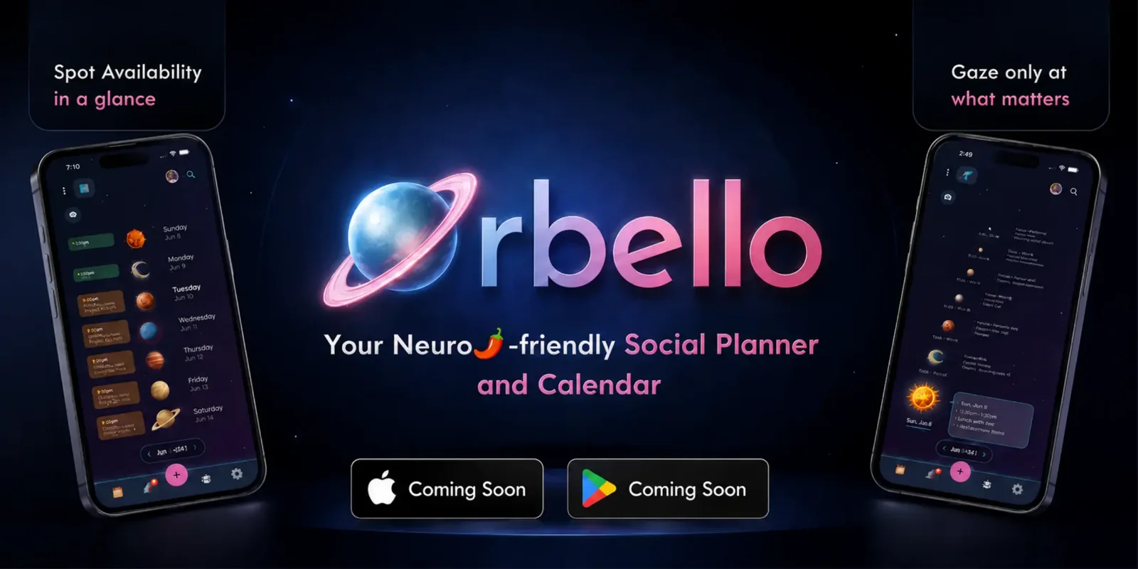
I founded Orbello, a pre-release shared calendar exploring how
people can coordinate with more context, more control, and less
pressure. I lead product direction, user research, visual direction,
prototyping, much of the AI-assisted build, branding, marketing
exploration, and iterative testing.
When
Role
Founder and product designer
Research
I carried a research stance from Spoonsaver forward: reduce
cognitive load, avoid one-size-fits-all defaults, and give people
more control over how they take in information.
Product & systems
Privacy and user control are decision rules. Current product scope
includes Gaze View, Signals, Groups, activity history, adjustable
settings, and layered person and event privacy controls.
I research the moments that decide whether a product earns trust or loses it.
Orbello: Coordinate Life, Not Chaos
Orbello · Founder and product designer · Jun 2025 – Present
Orbello is a pre-release shared calendar shaped through more than a year
of focused development. I used AI to accelerate exploration across research,
visual language, interaction design, motion, marketing, and implementation,
then relied on evidence, user feedback, and specialist judgment to determine
what advanced.
Read the full case study
RoleFounder, product direction, research, visual direction, prototyping, and much of the AI-assisted build
StatusPre-release and in active development
Primary signalAI UX, product strategy, interaction design, and inclusive design
CollaboratorsTwo feedback partners and informal testers; a Rive animator for finished motion craft
Act I: Reframe the problem
Coordination without cognitive overload.
Before Orbello, I worked on Spoonsaver, a private reflection concept
that participants found meaningful but did not expect to revisit
every day. A notification alone would not solve that repeat-use
problem. I carried the research stance forward: reduce cognitive
load, avoid one-size-fits-all defaults, and give people meaningful
control over how they take in information.
I then reviewed roughly six months of TimeTree App Store feedback as
qualitative competitor research. Shared calendars helped people
coordinate, but reviews also described noise, clutter, rigid views,
weak personalization, and low trust when calendar data behaved in
unexpected ways. I used that synthesis to ask a sharper question:
how could I help people coordinate without making the planner itself
another source of pressure?
Act II: Test what AI should help make
I directed AI, then checked whether the output was supported, intentional, and usable.
I used AI to widen the options around a specific question, then
brought the source material, references, constraints, selection, and
review. An AI-assisted competitor-research export exposed the limit
of a tool-only workflow when unrelated, zero-source features appeared.
I removed those ideas and tightened my source-checking process before
letting AI research shape a product decision.
I also tested visual direction before investing in it. I began with
a sketch, directed early iterations around material, texture, and
form, then showed a wood direction informally to people in relevant
communities and my broader research network. They described it as
human, warm, cozy, and creative. That feedback supported developing
a clay-and-wood language while keeping Gaze View simpler and more
functional.
Informal feedback artifact: I used this early direction to test whether the material language felt human and intentional. It is not the final in-app icon system.
My AI UX method in this project
Start with the decision. I used AI to explore a defined product question, not to request a finished feature.
Bring the constraints. I supplied references, source material, visual direction, and the standard the work had to meet.
Check the output. I verified whether the result was supported, usable, and appropriate for the product context.
Test what matters. I looked for feedback that could change a design decision, then labeled its strength honestly.
Revise or involve a specialist. I changed unclear work and brought in specialist craft when the medium called for it.
Act III: Build flexible coordination
I designed more than one way to take in time, availability, activity, and shared calendars.
I designed Gaze View as a future-oriented calendar that lets people
scan what is ahead without a monthly grid or past-event noise. When
people seemed unsure whether the telescope control was active, I
changed its active state from white to blue. Later feedback indicated
that the future timeline could feel dense, so I added an optional
focus mode that hides future floating-event text while keeping today
visible. People can reveal future detail again when they want it.
I also designed quiet coordination through Signals, activity history,
Groups, and layered privacy. A person can share a nuanced availability
opportunity or constraint, choose who sees it, and decide whether it
sends a notification. People can create and name their own Groups,
then move through familiar people and shared calendars with fewer
clicks. Individual event visibility can be overridden even where
someone normally has broad calendar access.
Reflection and current validation
I treated AI, implementation constraints, and specialist craft as part of the UX work.
Calendar sync could still be working when someone expected to see a
schedule. I moved it earlier in onboarding and set the expectation
that events might appear shortly after setup, rather than leave
people to interpret an empty calendar. That change still needs
validation. I do not claim that sync is fully reliable, instant, or
user-tested.
I also set the weekday-to-planet interaction direction and partnered
with a Rive animator for finished motion craft. The animator's
pushback strengthened a specific medium within a broader product,
research, and interaction system that I led. The work reinforced a
practical lesson: AI can extend expert work, but it cannot replace
expert judgment around product, technical, or motion craft.
Orbello remains pre-release. I can show the documented decisions and
current product behavior above. I am still validating onboarding,
calendar sync, notifications, settings, profile updates, event
creation, optional Google support, and the clarity of Gaze View,
Signals, Groups, and privacy controls before broader testing.
Learn-Iterate-Launch
Driving Engagement at Flyhomes
Flyhomes · Former employer · 2022
62% of qualified leads abandoned the platform before completing
their first search or tour, and the home search feature, Flyhomes'
key experience, was only engaged with by 11% of traffic. Usability
testing exposed why: almost nobody realized they could search for
homes on the site. A second phase tested the rebrand and a redesigned
homepage centered on search to better match buyers' mental models.
+60%homepage engagement
+30%booked calls
+20%activation rates
Read the full case study
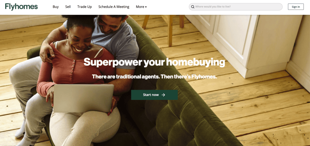
Driving engagement
A two-phase research program spanning onboarding, lifecycle
communications, brand, and the homepage experience.
RoleLead UX Researcher
Timeline2022
FocusActivation + engagement
MarketsEnglish + Mandarin
ApproachTwo-phase mixed methods
Key business problem
Strong acquisition. A broken first mile.
Flyhomes faced a critical business challenge: 62% of
qualified leads abandoned the platform before completing
their first home search or tour. Analytics showed decent
top-of-funnel conversion, but those gains evaporated during
activation.
The home search experience, a key activity for every
homebuyer, was engaged with by only 11% of traffic.
Key insight
The defining “oh $hit” moment.
During usability testing, almost every participant failed
to realize they could even search for homes on our website.
Less than a quarter noticed the search icon in the top-right
corner; those who did thought it searched a database.
I also discovered that excessive communication and a long
activation process were pushing new users away, compounding
the discoverability problem.
Why are they hiding the home search? I just want to browse like on Zillow!
Results
Research moved the homepage and the customer journey.
Strategic insights and post-study collaboration informed a
comprehensive rebrand and website redesign, making search
the cornerstone of the experience. I coordinated with
product development, marketing, brand management, and
creative design to carry the evidence into execution.
+60%Homepage engagement
−30%Customer communications
+30%Booked calls
+20%Activation rate
+60%SMS open rates
+359%Lost-lead SMS engagement
We brought lifecycle marketing, product marketing, and sales
together across English and Mandarin markets. Guided by my
customer journey map, the teams used data-driven insights to
create more resonant content and optimize communication
cadence through rigorous experimentation.
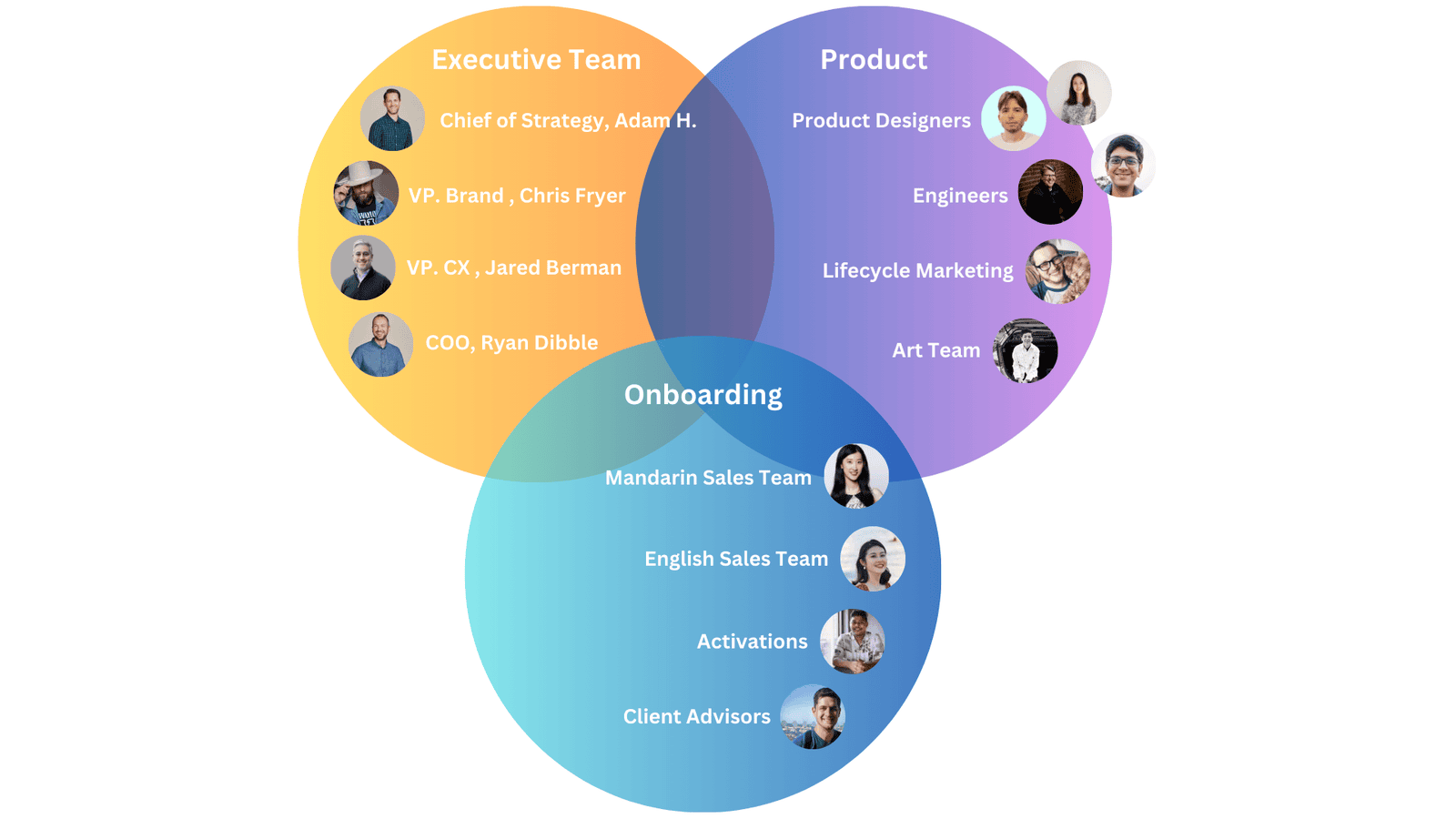
Research as a team sport
Alignment was built into the process.
By involving stakeholders from beginning to end through
1:1s, group meetings, and participant-viewing invitations,
I built alignment throughout the study. I also broke down
silos so the research could drive holistic impact across
design, lifecycle marketing, sales, and art and brand.
Embedded team structure across the research program.
Phase one · Customer quotes
The experience felt hidden and overwhelming.
I think if they lead with letting me browse instead of contacting me over and over, I would have
been happier upfront.
This search looks like a database search, not a home search bar.
Nothing important should ever be more than two clicks away…
There was a lot… When I first signed up, I felt like I was getting a ton [of emails].
ThemesOverlooked functionalityOutreach frequency
Teammates reviewing and building on the research findings.
Our response · Phase one
Make every touchpoint earn its place.
We developed a new content strategy that prioritized search
visibility, deeper product education, and clear customer
value in every communication.
I introduced a customer journey map to clarify who was
sending what and when, then optimized sequencing and cadence
to reduce overload. We also redesigned the homepage to make
search the focal point, which led me to initiate a second
research round to test design options using observational
and attitudinal feedback.
I started with stakeholder interviews to understand the
problem space, time constraints, and assumptions. A kickoff
aligned the team and established a communication plan. I
then presented study options, offered recommendations, and
partnered with stakeholders on the best approach.
01Key questions
02Learn
03Iterate
04Learn
05Launch
Phase 01
Map and improve new-user onboarding.
Diary study with pre- and post-interviews to track sentiment and goals.
Walk-the-store interviews to analyze first impressions and the onboarding journey.
“Break-up letters” to understand departures and identify opportunities.
Phase 02
Evaluate rebranded website engagement.
Walk-the-store testing to gather qualitative feedback on rebranded prototypes.
A/B tests to compare engagement across versions.
Identification of the design most effective at driving interaction.
What I learned
Participation works best when it is intentional.
01
Strategic stakeholder involvement
Involving too many people in every meeting slowed
decisions. I limited follow-up attendance and invited the
stakeholders most relevant to each research session and readout.
02
Tailoring insights for different teams
Marketing preferred a dedicated report for deeper
collaboration, while other teams benefited from targeted
readouts. Adapting the delivery improved engagement and actionability.
Our next steps
Testing the rebrand in phase two.
During phase two, I tested homepage design, brand content,
and messaging as part of the rebrand. This approved
highlight reel outlines part of that approach and my
communication style.
●
My colleague's face has been hidden as an additional privacy measure at her request.
Two-Phase Research
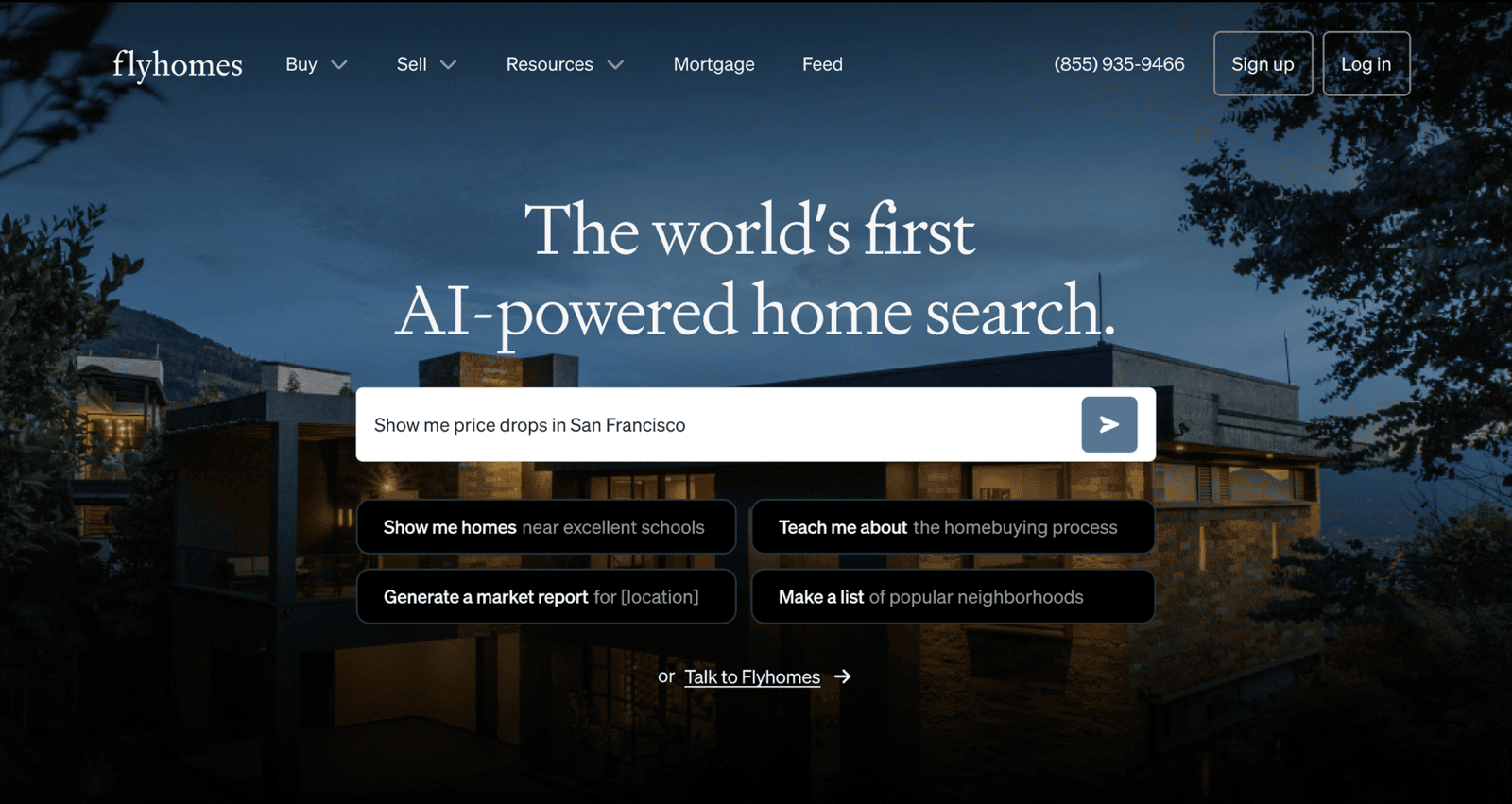
Disrupting Real Estate Search with AI
Flyhomes · Former employer · Nov 2022 – Jun 2023
Traditional search could filter price, beds, and baths, but not
natural light, architectural style, or neighborhood ambiance. We
turned unstructured listing language into searchable attributes
and paired it with weighted buyer preferences to make every result
more relevant and explainable.
+83%feature completion
+46%tour requests
+44%sign-ups
Read the full case study
An AI-assisted search experience built around the way
homebuyers describe their lives.
RoleLead UX Researcher
TimelineNov 2022–Jun 2023
ScopeDiscovery through launch
MethodsInterviews · Testing · A/B
Overview
A home search should understand more than a spreadsheet can.
Finding the right home is about lifestyle, ambiance, and
personal preferences, signals traditional search tools
often miss. In November 2022, I led the research and
contributed to the implementation of an AI-powered
Flyhomes search feature designed to bridge that gap.
We used natural language processing to turn unstructured
listing descriptions into structured home attributes, then
paired them with a personalized match score. The experience
helped buyers surface relevant homes faster and understand
why each one matched what mattered to them.
The work was featured by Business Wire and
USA Today.
The problem
The details buyers cared about were hidden in paragraphs.
Most real estate websites prioritize structured
data, price, beds, baths, and square footage, while
overlooking preferences like natural light, architectural
style, neighborhood ambiance, or proximity to grocery
stores.
Buyers had to read every property description manually,
making search feel like trying to spot the right tree in a
dense forest. Paid social campaigns were driving traffic,
but only a fraction of visitors found homes they loved or
booked a tour, the critical next step in engaging with
Flyhomes.
The solution
Three connected moments made search personal, fast, and clear.
01
Personalize the experience
Buyers select the home features they care about and set
how important each one is, creating a profile with room
for both must-haves and nice-to-haves.
View animated preference setup
Animation demonstrates a buyer choosing home features and assigning an importance level to each
preference.
02
Save homebuyers time
Listings are ranked by a personalized match score,
reducing the number of irrelevant homes buyers need to
review without hiding lower-scoring options.
View animated match scores
Animation demonstrates search results ordered by personalized match scores, helping buyers
review the most relevant homes first.
03
Make every listing easier to scan
Feature tags appear directly on listing detail pages so
buyers can quickly understand which parts of a home
align with their preferences.
View animated listing details
Animation demonstrates a listing-detail page where visible feature tags explain how a home
aligns with a buyer’s saved preferences.
Approach & timeline
Two research phases carried the idea from discovery to launch.
Phase 01 · FormativePhase 02 · Evaluative
Nov ’22User interviews
Dec ’22Listing analysis
Jan ’23Journey mapping
Feb ’23Questionnaire design
Apr ’23Card sorts
May ’23Usability tests
Jun ’23A/B testing
01
Started Nov 2022 · 3 months
Discovery & design
Identify the preferences missing from traditional
search, then build a model that could connect those needs
to the language in real listings.
01
User interviews
I interviewed prospective homebuyers and current
customers to understand which meaningful attributes
typical filters missed. Participants repeatedly cited
grocery access, neighborhood ambiance, architectural
character, and the feeling of natural light.
02
Listing analysis
We analyzed more than 10,000 property listings, focusing
on unstructured agent remarks. This showed how frequently
the attributes buyers valued appeared in real inventory
and what the product could reliably support.
03
Questionnaire design
I synthesized the evidence into a preference flow that
balanced high-coverage attributes such as proximity to
schools and modern style with lower-coverage, high-value
needs such as natural light and nearby restaurants.
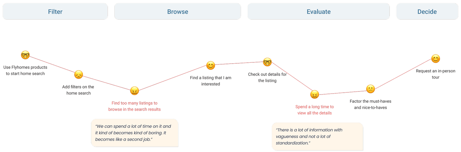
Journey mapping
Mapping the end-to-end experience revealed where
personalization could remove effort without taking
control away from buyers.
Read a text description of the journey map
The map traces five stages: Filter, Browse, Evaluate, and Decide. It begins with buyers
overwhelmed by too many filters, drops again when they find too many listings to browse, then
improves when browsing feels more intuitive. During evaluation, buyers spend a long time reviewing
details and encounter repeated or frustrating results. At the decision stage, the journey rises
when buyers return to the original search tool. One participant described the task as becoming
“like a second job,” while another cited inconsistent listing information and vague
standardization.
Our hypothesis
Structured preferences would make relevant homes surface faster.
Higher engagementRelevant results would give buyers a reason to keep
exploring.
More tour requestsA tailored shortlist would make the next step feel
more confident.
Better lead generationA personalized entry point would convert more
visitors into leads.
From raw text to relevant homes
The product connected listing intelligence to buyer intent.
Input · Listing data
AI-processed listings
ChatGPT and Scale AI parsed agent remarks for attributes
hidden in free-form text. A dedicated back-end service
converted phrases into fields such as “lots of natural
light” or “big backyard.”
Output · Personal ranking
Match score algorithm
Questionnaire responses became a weighted preference
profile. The system scored every property and prioritized
top matches without excluding lower-scoring homes,
reducing fear of missing out.
02
Started Apr 2023 · 2 months
Iteration & launch
Test how people interpreted the experience, refine the
information architecture, and validate that
personalization improved real product behavior.
01
Usability testing
I ran three rounds with five users per round. Iteration
between rounds simplified question wording and added
tooltips for terms such as “open concept,” improving
clarity without slowing the flow.
02
Card sorting
I conducted card sorts with 10 homebuyers to organize a
broad set of home attributes around user mental models
rather than internal real estate terminology.
03
A/B testing
We compared the AI-based search with the existing
experience, measuring completion, satisfaction, sign-ups,
and in-person tour requests.
Key insights
Buyers wanted personalization without losing control.
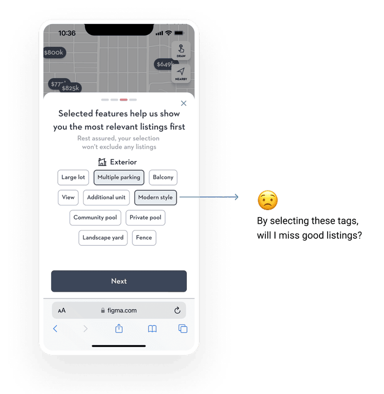
Insight 01Tags looked like filters.
Participants worried that preferences would hide
listings because their established filter mental model
implied strict exclusion.
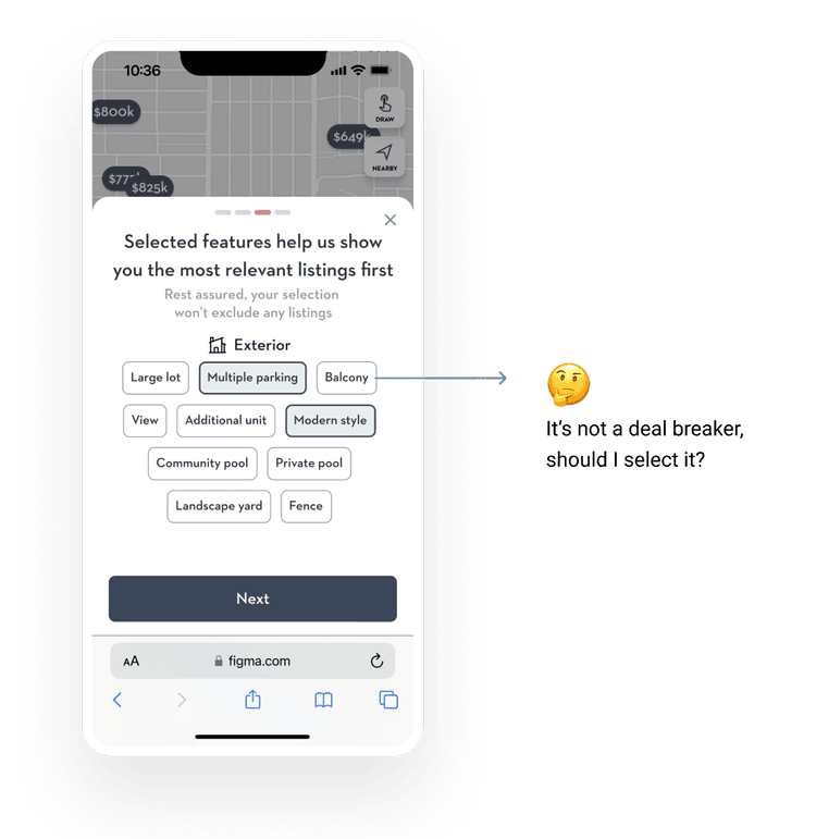
Insight 02Not every preference is equal.
Buyers naturally separated must-have fundamentals from
nice-to-have features, but a binary interaction could
not capture that nuance.
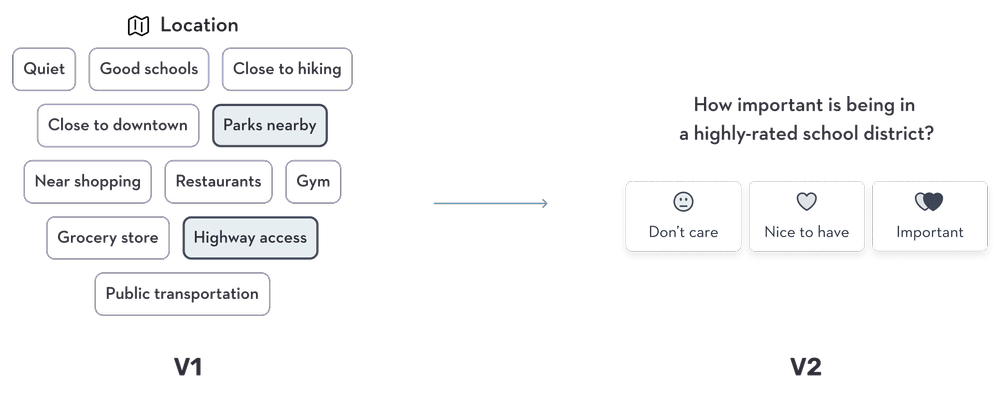
Iterative refinements
We changed the model from selection to prioritization.
Multiple design reviews and testing rounds simplified
the questions, expanded the attribute set, and made the
results easier to understand without overwhelming
buyers.
Rebalanced match-score weighting so nice-to-haves would not overshadow location and
price.
Compared completion, satisfaction, and tour-request behavior with the existing search.
Replaced binary toggles with importance weighting for every preference.
Read a text description of the iteration diagram
Version 1 presents a broad location-filter set, including river, good schools, hiking, downtown,
parks, shopping, restaurants, gym, greenery, highway access, and public transportation. Version
2 replaces that collection with a direct question about the importance of living in a highly
rated school district, offering three choices: Don’t care, Nice to have, and Important. The
change shifts the interaction from many binary selections to a clearer importance preference.
Design decisions were traced directly to observed buyer behavior.Final validation
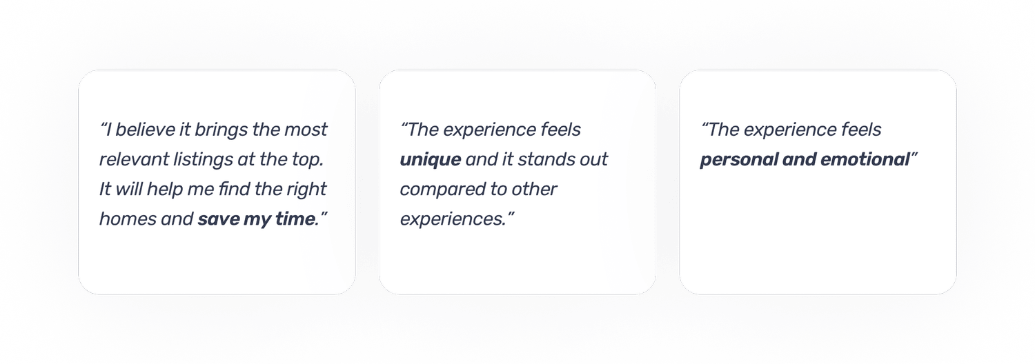
Participants reported that the refined experience could
save significant time, the outcome the team set out to
create.
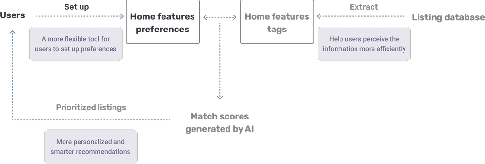
How the solution works together
Listing details and user-defined priorities combine into
a match score for every home. The score ranks
recommendations while visible tags explain why each
result is relevant.
The impact
AI made search feel more human.
By making subjective preferences searchable and showing
buyers why a home matched, Flyhomes reduced search effort
and helped more people take the next step.
83%increase in feature completion
46%increase in tour requests
44%increase in sign-ups
Mental-model mapping
Clinical AI Adoption
MedTech AI · Client anonymized · 2023 – 2024
Interviews with 15 international embryologists and lab managers
exposed black-box distrust, HIPAA friction, and a product that
graded embryos when clinicians wanted a conversational clinical
partner. The findings redirected the roadmap and cut sales friction
by about 60%.
15embryologists and lab managers
EU + USclinical experts
60-minsemi-structured IDIs
~60%lower sales friction
Read the full case study
The challenge
Clinical AI was shipping. Trust was not.
The company needed to understand how embryologists and lab
managers would adopt generative AI inside IVF workflows.
Early product direction treated the model as a reactive
binary embryo grader. In the field, black-box scoring,
HIPAA anxiety, and slow system speed were already teaching
clinicians not to rely on the tool.
The opportunity
Map the mental model before the next roadmap bet.
Rather than validate a single UI pass, I designed research
that could answer a harder question: what kind of AI partner
would clinical leaders actually trust with high-stakes
decisions, and what product, training, and transparency
changes would make adoption real.
01 / Framing
Four questions kept the study close to product strategy.
01
How do embryologists and lab managers currently make high-stakes clinical judgments?
02
Where does AI earn trust, and where does a black-box score actively block adoption?
03
Which workflow, privacy, and performance failures force clinicians back into manual work?
04
What would make clinical leaders champion the product instead of quietly working around it?
02 / Approach
Deep interviews with the people who cannot afford a wrong call.
I led 60-minute in-depth, semi-structured interviews with
15 international embryologists and lab managers across
Europe and the US. The protocol mapped mental models of
clinical AI, probed black-box and HIPAA concerns, and
pressure-tested whether a binary grader matched how labs
actually reason about embryos, risk, and accountability.
◈Specialist sample
15 embryologists and lab managers across Europe and the US.
◎60-minute IDIs
Semi-structured depth interviews built for mental-model mapping, not feature polling.
⬡Tier 3 AI evaluation
Assessed generative clinical architectures for transparency, speed, and human-in-the-loop
failure points.
✦Executive handoff
Final Research Handoff presentations translated findings into personas and roadmap
recommendations for C-suite, Product, and Engineering.
03 / Findings
Clinicians did not want a score. They wanted a super brain.
Across markets, experts described the ideal AI as a
proactive, conversational partner that educates them and
analyzes the whole clinical picture. A reactive binary
grader fought that mental model and made distrust feel
rational rather than resistant.
Adoption blockers surfaced in interviews
Black-box transparency gapsCore
HIPAA and data-privacy anxietyCore
Slow scores forcing manual double-checksHigh
Error states driving IT support ticketsHigh
Relative intensity from qualitative synthesis across 15
interviews, not a statistical prevalence survey. The
pattern was consistent enough to reframe the product bet.
Defining insight
Users expected AI to act as a proactive conversational
partner and "super brain" analyzing the whole picture,
not a binary embryo grader that handed down unexplained
scores.
That single mental-model gap turned a feature debate into
a strategy debate: keep optimizing a grader clinicians
double-check by hand, or rebuild toward a holistic,
predictive clinical simulator they could reason with.
Trust signal
Training was not a nice-to-have. It was the trust layer.
Clinical leaders did not prioritize software training. When
the product failed to explain itself in the language of
published science, adoption stalled before the UI ever got a
fair trial. Trust had to be earned upstream of the
interface.
~60%reduction in sales friction after aligning the tool with published science and vendor-led
video training
From hidden friction to a clearer adoption path
Opaque scoreManual checkTicketScience
fitChampion
Qualitative adoption path synthesized from interviews; not a percentage scale.
04 / Decisions
The research forced three product moves, not one UI tweak.
Findings were packaged for people who owned roadmap,
architecture, and go-to-market, so the study could change
more than a screen.
01
Roadmap pivot
Advised shifting from a reactive binary grader toward a holistic, predictive AI simulator
aligned to clinical reasoning.
02
Transparency and speed debt
Aligned stakeholders on black-box gaps and slow scoring that forced manual double-checks and
inflated clinician workload.
03
Error-state cleanup
Called out high-friction failures that pushed users into IT tickets, and recommended
automation for daily administrative paperwork.
04
Science-led enablement
Recommended vendor-led video training tied to published scientific papers so clinical leaders
could trust the tool before they ever clicked around in it.
05 / Influence
The handoff had to work for C-suite, Product, and Engineering in
one room.
↗
Personas that traveled
Actionable clinical personas that kept expert language intact without drowning non-clinical
stakeholders.
◈
Strategy narrative
A clear argument for the conversational clinical partner over the binary grader, grounded in
repeated mental-model evidence.
≡
Final Research Handoff
Executive-ready recommendations covering roadmap direction, technical debt, support deflection,
and trust-building enablement.
06 / Impact
Research changed the product bet and the sales conversation.
Product movement
Roadmap pressure shifted toward a holistic predictive simulator instead of a binary grader.
Transparency, speed, and error-state debt became explicit engineering priorities.
Support-driving failure states were marked for automation and clearer recovery paths.
Go-to-market movement
Enablement was reframed around published science and vendor-led video training.
Sales conversations gained a trust story clinicians recognized immediately.
Clinical adoption stopped being treated as a UI polish problem alone.
Sales friction
~60% reduction
Experts
15 EU + US clinicians
Format
60-min depth interviews
Scope
Roadmap + trust + ops
Outcomes reflect documented study recommendations and the
reported sales-friction reduction tied to science-aligned,
vendor-led training. Client name and proprietary model
details remain under NDA.
07 / Reflection
What I chose, what I traded off, and what I would add next.
Decisions I made
Recruited true domain experts instead of adjacent healthcare proxies.
Evaluated the AI architecture and the workflow, not only the interface.
Packaged findings as a strategy handoff so Product, Engineering, and GTM could move
together.
What I would do differently
Add in-lab observation to capture double-check behavior as it happens.
Prototype explainability patterns with clinicians before the next architecture sprint.
Pair the qualitative mental models with a lightweight trust metric tracked over releases.
NDA boundary
Client identity, proprietary model details, and internal metrics beyond the approved outcomes
stay private.
Method tradeoff
Depth interviews revealed mental models clearly, but could not quantify prevalence across every
clinic type.
Sample boundary
Embryologists and lab managers were represented; adjacent roles such as clinic administrators
were out of scope.
Adaptation strategy
When training emerged as a trust gate, recommendations expanded beyond product UX into
enablement and sales motion.
Usability benchmark and validation
FinTech Rewards, A Measurable Usability Jump
FinTech · Anonymized
A user opens the rewards screen, taps "redeem," and bounces. That
single abandoned flow hid a usability problem worth millions. We
benchmarked it, redesigned against the data, and proved the lift
with the same numbers leadership trusted.
58 → 81System Usability Scale
+53%task completion
−47%redemption drop-off
Read the full case study
The business question
A user could open the rewards screen, tap redeem, and leave
three steps before completion. That moment made the problem
concrete for the team: a high-value flow was losing qualified
users before they could understand what had gone wrong.
How I framed the work
I paired a baseline usability benchmark, including System
Usability Scale scoring and task analytics, with a heuristic
teardown. The baseline gave the team a shared way to describe
the problem before discussing solutions.
What we tested
Three rounds of moderated testing examined redesigned
redemption flows. Each iteration focused on the moments that
made the task harder to complete, then returned to the same
baseline measures so the team could compare progress rather
than rely on preference alone.
What changed
System Usability Scale scores rose from 58 to 81, task
completion increased 53%, and redemption drop-off fell 47%.
Measuring the before and after states with the same yardstick
gave leadership a credible basis for moving the redesign
forward.
Evidence boundary
Client identity, interface details, population definition, and
underlying task analytics remain confidential. The approved
figures describe the measured redemption flow only. They do
not represent a portfolio-wide or post-launch business result.
Journey research and service design
Why Volunteers Deliver Once and Disappear
Helping Hands Community · Nonprofit contract · Jul–Dec 2021
During COVID, Helping Hands Community, a tech nonprofit founded by
ex-Google and Lyft leaders, mobilized volunteers to home-deliver
food boxes to at-risk neighbors. Deliveries were happening, but
volunteers were quietly churning after a single shift. As contract UX
researcher (and part-time designer), I stood up the org's first formal
research practice, prioritized the work by business and user impact,
and treated retention as a journey problem. Interviews, mobile-first
usability tests, service blueprints, and synthesis produced six
friction themes, POV statements, a future-state volunteer flow, and
18 concrete recommendations the team could ship against.
6friction themes uncovered
18recommendations delivered
50%+volunteers arriving via mobile
1stformal research practice at HHC
Read the full case study
The retention problem
Home delivery was the program's hardest-working channel and its
leakiest. People signed up with good intentions, completed one
delivery run, and never came back. Nobody knew exactly why.
Recruiting harder would not fix a broken experience, so I
treated retention as a journey problem, not a headcount problem,
and went straight to the volunteers themselves.
Helping Hands sat at a B2C and B2B intersection: at-risk
neighbors receiving food, home-delivery volunteers, partner
organizations, and internal ops. My first move was not a single
study, but a research portfolio. I listed every plausible
research project in a spreadsheet and scored each on business
impact, user-experience impact, resources, and time, then focused
on the highest-impact, lowest-waste work. For the volunteer
retention study I wrote a full research plan: discussion guide,
screeners, process outline, and participant criteria. It was the
first formal research plan the org had run.
Constraint No prior research baseline; lean nonprofit resources
I worked directly with stakeholders from a founding team with
Google and Lyft product DNA, which meant high expectations for
rigor and a real appetite for journey-level thinking, including
problems that lived off the screen.
How the research ran
Finding the right people was half the work.
Some segments were narrow, especially home-delivery volunteers.
I recruited through Facebook groups and Reddit, then ran a second
filter most screeners miss: a short pre-interview call before any
session was booked. That kept the sample honest when the segment
was scarce.
Remote usability tests on volunteer sign-up.
Analytics showed more than half of volunteers arrived on mobile,
so every onboarding test ran on both desktop and mobile. I
focused on two segments pulled from prior volunteer data, namely
people aged 18–25 and people 55+, because those cohorts
represented different device habits, physical constraints, and
expectations. Sessions were exploratory rather than timed: the
goal was conceptual models and failure points, not stopwatch
optimization.
Semi-structured interviews, recorded with consent.
With no research partner in the room, I recorded Zoom sessions so
I could stay present in the conversation and take structured notes
from the footage afterward. Because there was no prior research
corpus, the guide stayed semi-structured on purpose, tight enough
to answer the core questions, loose enough to chase surprising
turns. Each interview walked the full arc from “I wonder what
volunteering here is about?” to the quiet moment after the last
drop-off.
Service design beyond the UI. Drawing on UCLA
Extension service-design training, I mapped front-stage and
back-stage work in service blueprints across journey stages:
consent and rights flows, information checks, handoffs ops owned
that volunteers never saw. Several of the retention leaks only
showed up once the blueprint made those handoffs visible.
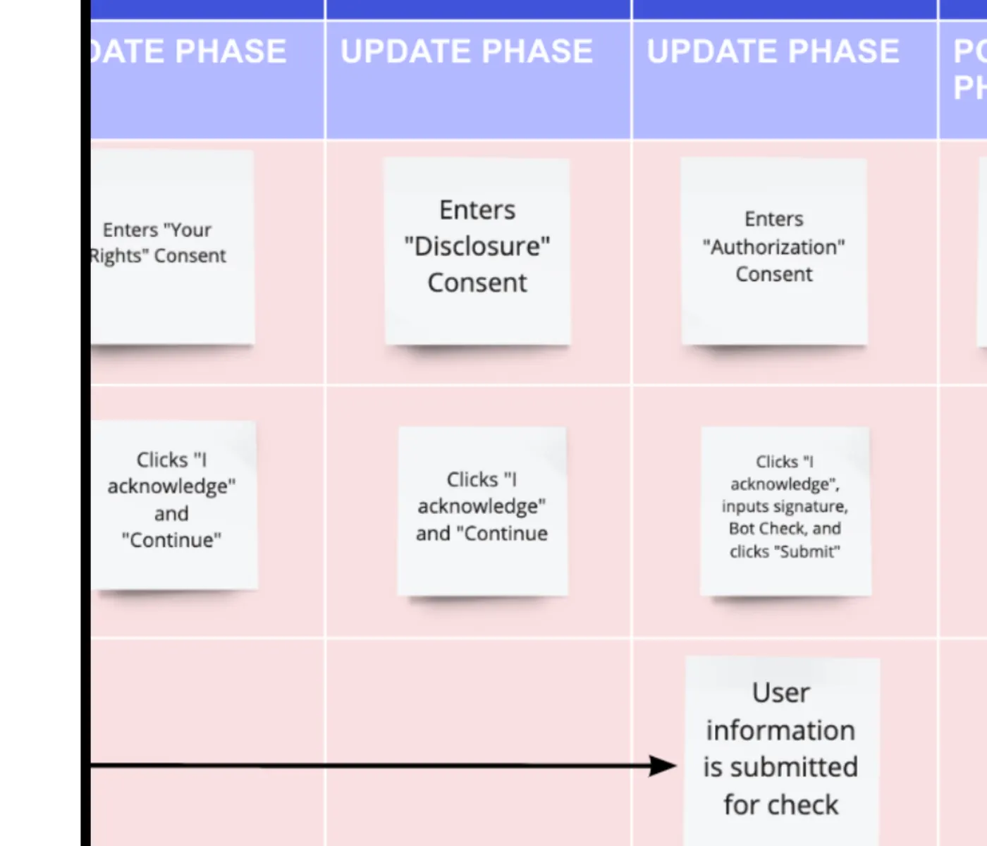
Read a text description of the service blueprint
The visible blueprint segment maps a sequence of consent updates. A volunteer enters Your Rights
consent, then Disclosure consent, then Authorization consent. They acknowledge and continue through
the first two steps; authorization also requires a signature, bot check, and submission. The
submission sends user information for review, exposing operational handoffs that are not visible in
the volunteer interface.
Off-the-screen process mapping: consent, handoffs, and checks
that shaped the volunteer experience as much as any screen.
What volunteers told us
Synthesis used highlighter coding on transcripts, affinity
clustering to connect patterns, and 5 Whys on the sharpest issues
to separate symptoms from root causes. Six friction themes held
across the journey:
1. Flexibility comes first. Busy people needed
control over when they volunteered, where they delivered, and
how many boxes they took on. “There's just certain neighborhoods
that I'm not comfortable delivering to alone.”
2. Know before you commit. Volunteers walked in
blind to what the job actually required. “I don't recall being
warned about how heavy the boxes are.”
3. The job needs tools. Heavy boxes, stairs,
towing anxiety, and language barriers made shifts physically and
mentally harder than they had to be, especially for volunteers
over 55.
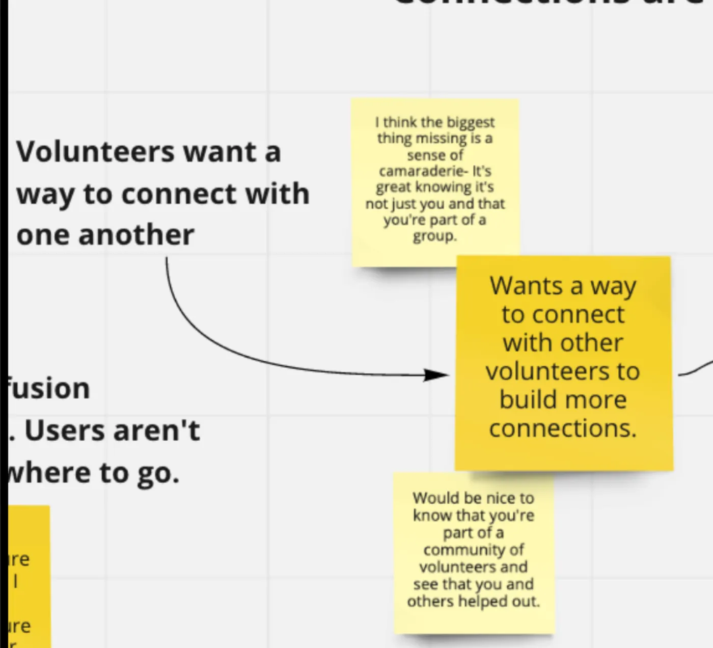
4. Volunteering felt lonely. “I think the
biggest thing missing is a sense of camaraderie. It's great
knowing it's not just you and that you're part of a group.”
5. There was no ending. Shifts ended with
silence instead of closure or impact.
It was just kind of like you finish and then you drive away.
No reporting back. Thought it was a bit odd, it did feel off.
I was just like, oh, what should I do?
6. Routing broke trust. “The first time when I
put in the link it didn't even show me the stops. And so I'm
like, I'm not going to bother with this.”
Read a text description of the volunteer-quote board
The board synthesizes the theme that volunteers want ways to connect with one another. A participant
says that the biggest missing element is camaraderie and that it is meaningful to feel part of a
group. The highlighted insight recommends ways for volunteers to build more connections, while
another note calls for feedback that shows they are part of a community and that their work helped
others.
Synthesis made the emotional gap impossible to ignore.
Volunteers wanted proof they were part of something, not just
a route on a map.
Recommendations and how insight traveled
The 18 recommendations mapped each theme to a fix the product and
ops teams could act on:
Availability schedules visible to partner organizations; box
counts volunteers choose themselves (3 to 10, with time warnings);
a four-step explainer carousel and wiki that answer most questions
before commitment; dolly-and-partner prompts at sign-up; shared
community spaces for volunteers; a “done” checkout that triggers
impact stories and recipient thanks; and just-in-time routing with
the stop order curated in advance.
Deliverables were built for mixed audiences: POV statements, a
future-state volunteer flow, service blueprints, and weekly
readouts that mixed video clips, audio, and verbatim quotes so
stakeholders heard volunteers in their own voice, a habit that
comes straight from my film background. Early, frequent sharing
kept founders and ops aligned while the study was still running,
not only at the final readout.
The strongest signal in the data was the one the program had
never designed for: volunteers stay when they can feel the impact
of their work.
When people directly thank you, that makes everything worth
it. It gave me the sense of THIS IS WHY.
What I would carry forward
Prioritize the portfolio, not just the study.
Scoring possible projects on impact versus cost kept a lean
nonprofit focused on the leak that mattered most.
Recruit like the segment is rare, because it is.
Community channels plus a live pre-screen beat a polished screener
alone when participants are specific and unpaid.
Retention is a service, not a screen. Blueprints
and off-the-screen handoffs explained churn that UI-only testing
would have missed, especially the missing ending after the last
drop-off.
Three-act case study
Making a digital front door easier to enter
Regional health system · Client anonymized
Patients could lose trust before they reached scheduling. Eight moderated sessions showed that the core
issue
was not page polish. It was finding the right path with confidence.
8screened participants
60 minscenario-based sessions
2page templates
Landing → schedulingjourney covered
Read the full case study
RoleLead UX Researcher
GoalIdentify findability, trust, and scheduling friction across the patient
journey.
MethodEight 60-minute, scenario-based walk-the-store sessions, plus open card
sorting.
ConstraintClient, patient data, interface screens, and downstream conversion data
remain private.
01 / Setup
The patient journey started with uncertainty.
The team needed to improve a journey from the landing page to appointment scheduling while
validating
Orthopedics and Cancer Care templates. The key question was simple: could people find the right
service
and feel ready to act?
The turning point
Participants did not experience trust as a branding problem. Buried symptom checkers, unclear
layouts,
and weak calls to action made the next step feel uncertain.
02 / Act II: Investigation
Follow the patient journey before judging the page.
Participants completed realistic scenarios across two page templates. The sessions focused on finding information, interpreting service options, and deciding what to do next, not on visual preference alone.
01
Scenario-based navigation
Sessions recreated the moments when people need to understand symptoms, services, and the next
action.
02
Walk-the-store observation
Following the full path made handoffs and dead ends visible instead of treating each page in
isolation.
03
Open card sorting
Card sorting tested how patients expected services and support content to be grouped.
Research decision
Improve the path people can understand, not only the pages they can see.
The study put information architecture and progressive disclosure ahead of visual refinement.
03 / Action
Turn uncertainty into a clearer next step.
Recommendations
Align the information architecture with patient mental models.
Surface symptom support sooner in the journey.
Use progressive disclosure so complex choices do not arrive all at once.
Research value
Created a strategic baseline for navigation and template decisions.
Connected service discovery, trust, and scheduling in one journey view.
04 / Evidence boundary
What this case does and does not claim.
This case covers
End-to-end patient journey research from landing to scheduling.
Findability, trust, and information architecture recommendations.
This case does not claim
No patient outcome, appointment-conversion, or later redesign result.
No client identity, private screen, or patient information.
Three-act case study
When invisible security feels like no proof
Smart-home security team · Client anonymized · Applause era
A camera-free security experience could sense motion, but Wi-Fi latency sometimes left people without reliable proof of what the signal meant. Two rounds of diary research turned that trust gap into a focused set of diagnostic, visualization, and feedback recommendations.
Research evidence at a glance
Decision at stake
How might a camera-free security experience make sensed activity understandable and credible?
My role
Co-lead UX Researcher.
Why this approach
A seven-day comparative diary study could capture trust during repeated use, while a single session could not.
Strongest evidence
Across two research rounds, eight participants encountered a “silent entry” moment in which Wi-Fi latency made the meaning of a sensed event unclear.
What the evidence enabled
Recommendations for pre-installation diagnostics, floor-plan visualization of motion data, and active audio feedback. Implementation and outcome are not claimed.
Public evidence boundary
The client, product names, competitors, technical screens, launch status, and downstream performance remain private.
8participants
7 dayscomparative diary study
2research rounds
3recommendation areas
Read the full case study
RoleCo-lead UX Researcher
GoalUnderstand whether a camera-free security experience could earn user trust.
MethodTwo-round comparative diary study with daily surveys and final video
testimonials.
Security without a camera asks for a different kind of
confidence.
The team needed to test setup, feature discovery, and the emotional effect of protection people
could not visually verify.
The turning point
Wi-Fi latency created a silent-entry failure. The system had a signal, but users had no reliable
proof of what it meant.
02 / Research
Let the first week change the second.
01
Two rounds, not one static study
Daily diary evidence shaped the focus of the second round while the experience was still fresh.
02
Trust as a mental model
The research tested whether people could understand and believe an invisible form of coverage.
03
Engineering in the room
The finding linked user doubt to data quality, not just to interface wording or education.
Research decision
When the signal is late, the product has to explain what users can trust.
The design question shifted from feature discovery to visible evidence and better diagnostics.
03 / Action
Make trust observable before asking users to rely on it.
Recommendations
Build a pre-installation diagnostic to filter poor ISP data.
Visualize motion data on a floor plan.
Add active audio feedback to make system response clearer.
Research value
Turned a vague trust concern into a specific failure loop.
Gave product and engineering a shared direction for resolving it.
04 / Evidence boundary
What this case does and does not claim.
This case covers
Iterative diary research on security trust and setup.
Recommendations for diagnostics, feedback, and understandable proof.
This case does not claim
No client identity, commercial launch, acquisition, or product-performance result.
No private technology, competitor comparison, or interface detail.
In medias res
Rebuilding a self-service menu around customer language
Major U.S. bank · Client anonymized · Applause era
The existing voice menu made common tasks hard to find. Tree testing and card sorting moved the conversation
from internal menu logic to the language customers used for self-service.
17tree-test participants
30card-sort participants
26tasks categorized
2recommended menu clusters
Read the full case study
RoleLead UX Researcher
GoalImprove task findability and language for a 24-hour self-service voice system.
MethodRemote tree testing plus open card sorting across 26 banking tasks.
ConstraintClient, internal menu artifacts, and the baseline failure percentage
remain withheld pending public-use clearance.
01 / Hook
A self-service menu is only useful when people can find
themselves in it.
The team was introducing new do-it-yourself options, but the existing structure did not match how
customers grouped everyday banking tasks.
The turning point
Findability evidence showed that the problem was structural. Better labels inside the same menu
would not be enough.
02 / Research
Test the tree, then ask customers to build a better one.
01
Tree testing
Remote sessions exposed where people expected to find common self-service options and where the
current hierarchy failed them.
02
Open card sorting
Thirty participants grouped 26 tasks in their own language, making natural customer clusters
visible.
03
Decision synthesis
The team received a clear rationale for changing the top-level structure rather than tuning
individual prompts.
Research decision
Organize around what customers came to do, not how the organization described its
services.
The evidence supported a simpler structure centered on self-service and money movement.
03 / Action
Turn findability evidence into a menu decision.
Recommendation
Restructure the menu around Self-Service and Money Movement clusters.
Use customer language as the basis for naming and grouping options.
Research value
Connected a known findability problem to a defensible structural change.
Provided both diagnostic and generative evidence for the same decision.
04 / Evidence boundary
What this case does and does not claim.
This case covers
Tree testing and card sorting for a self-service voice information architecture.
Evidence that informed a new top-level grouping model.
This case does not claim
No post-launch completion, handle-time, or company voice-AI outcome.
No internal IVR map, client name, or withheld baseline percentage.
Three-act case study
A dashboard cannot earn trust on fragmented data
People analytics platform · Client anonymized · 2023 – 2024
Leaders wanted more proactive people analytics, but interviews showed they were still managing fragmented
data
and reactive workflows. A five-tier framework made the product tradeoffs visible.
13HR, DEI, and talent leaders
45 minsemi-structured interviews
5framework tiers
1roadmap decision model
Read the full case study
RoleUX Researcher
GoalAlign a people analytics roadmap with executive priorities and data realities.
MethodThirteen 45-minute interviews with HR, DEI, and talent leaders.
ConstraintClient, third-party systems, release details, and commercial results
remain private.
01 / Setup
The opportunity was not another dashboard. It was a path from
reactive data to useful action.
The team needed to understand how leaders used people analytics across a complex software ecosystem
and where a product roadmap could create real value.
The turning point
Participants described a recurring constraint: fragmented historical data and integration gaps made
advanced insights hard to trust.
02 / Research
Create a decision hierarchy before designing advanced features.
01
Leadership interviews
Conversations with HR, DEI, and talent leaders surfaced the difference between what teams
wanted and what their data could support.
02
Five-tier framework
The Hierarchy of Needs moved from keeping the lights on through safety, efficiency, team
health, and belonging.
03
Data integrity first
Research made the case for standardizing data before asking leaders to act on predictive
signals.
Research decision
Proactive intelligence only matters when the underlying data deserves executive trust.
The roadmap moved from feature excitement to a staged sequence of integrity, visibility, and
prediction.
03 / Action
Give leaders a path from signal to decision.
Recommendations
Standardize data integrity before leadership rollout.
Prioritize proactive alerts for retention deviations.
Use customizable headings and a unified dashboard to make insight easier to act on.
Research value
Created a shared framework for C-suite, product, and engineering tradeoffs.
Connected data quality to the credibility of predictive AI features.
04 / Evidence boundary
What this case does and does not claim.
This case covers
Strategic research, framework development, and recommendations for people analytics.
Data-integrity and predictive-alert tradeoffs from executive interviews.
This case does not claim
No released feature, adoption, retention, or revenue result.
No client, third-party platform, or proprietary data detail.
Recommendations
What collaborators say about my work.
Leaders across growth, product, strategy, and AI on turning customer
insight into decisions that move teams forward.
“Zack is a highly insightful and tech-savvy UX leader known for his easygoing personality and
collaborative nature.
He helped me understand the Jobs To Be Done (JTBD)
framework when I was tasked with applying this method in a
study. He is particularly knowledgeable about AI tools and
shared his expertise by delivering a presentation on AI use
cases to our team as part of professional development
initiatives. Zack is truly a delight to work with.”
Tree HinesUX and Consumer Insights Researcher
“He’s the embodiment of turning insights into action
and an absolute pleasure to work with. He’s helped unlock insights
that’ve turned into company-wide messaging frameworks, personas,
communication strategies, and more.”
Matthew HelfrichSr. Director, Growth Marketing
“Zack is a UX super star.
His customer-driven insights made an immediate impact on our entire product team.
He pairs strong customer empathy with an ability to pinpoint the
most important customer problems for the team to go solve.”
Meredith HanVP of Product
“Zack isn’t afraid to challenge the status quo.
He’s adept at building trust within an organization, digging into the problems the team is
facing
& surfacing real world, tangible evidence that alter the
direction of a product – for the better!”
Andria JannettiProduct Manager
“Zack is a creative, thoughtful, empathetic, and engaging leader.
Any company would be fortunate to have him on their team, and I
offer my highest recommendation!”
Maggy WardellStrategy & Operations Leader
“Zack isn’t just good, he is shockingly good. Each time he
produced results something about it went above and beyond what
I expected, what was shocking was how consistently he did
that. He constantly demonstrated
a level of experience and expertise that I have only found in the most seasoned
veterans.”
Christopher FryerVP of Product & Brand
“I was always impressed by his great empathy for users, high
quality user reports and dedication for the company mission. He
is always passionate, curious and willing to contribute more!
Zack is truly the best researcher I’ve ever worked with.”
Elaine HeAI Product Manager
Method spotlight
The practice behind the studies.
Case studies are the visible output. These are the operating methods
that make research findable, shareable, and scalable across a whole
organization.
▤
The Knowledge Store
A research repository and ResOps infrastructure that turns
one-off studies into a searchable, tagged single source of truth, wired into product workflows so insight is
found when it's needed,
not buried in a deck.
↗
Democratizing Research
Stakeholder observation, monthly-business-review integration, and
mentorship programs that scale research literacy, so teams can
run solid studies themselves while research keeps the guardrails.
✦
AI-Augmented Research
Synthesis pipelines and automated ethnography, transcription,
clustering, and theme detection, that compress analysis time
while keeping a human in the loop on every interpretation.
Resource 01 · Inclusive design
Design for more ways of thinking.
An accessible field guide for reducing cognitive load, supporting
different sensory needs, and giving people more control over how they
experience a product.
5 min read
8 principles
1 goal: make experiences calmer for more people
Read the 8 principles
Field guide · 8 principles
Neurodiversity-Friendly Design Principles
Simple, practical design rules that make digital experiences
calmer, clearer, and easier for more people to use.
Remove anything that does not help someone move forward.
02
Build predictable patterns
Stay consistent and organized
Put similar information in similar places.
Use size and weight to show what matters most.
Create clear patterns, then apply them consistently.
Give every element a logical, expected place.
03
Support comfortable reading
Optimize readability and typography
Choose highly readable sans-serif typefaces.
Avoid all caps and long passages of italic text.
Use comfortable type sizes, line heights, and spacing.
Maintain strong contrast and a clear text hierarchy.
04
Lower sensory noise
Design with sensory sensitivity in mind
Use a calm, considered color palette.
Avoid flashing, sudden motion, and neon backgrounds.
Keep sound off by default and provide clear controls.
Reduce competing visual and audio signals.
05
Remove ambiguity
Communicate clearly and directly
Prefer literal language over metaphors or sarcasm.
Give each message one clear meaning.
Label controls with specific actions, such as “Send message.”
Avoid jokes or wordplay where clarity is essential.
06
Help people keep their bearings
Simplify and clarify navigation
Keep navigation compact, visible, and predictable.
Label every page and destination clearly.
Show progress during multi-step tasks.
Make the current location and route back easy to find.
07
Give people control
Offer personalization and flexibility
Let people adjust text size and color schemes.
Offer calm and vivid display options where useful.
Allow optional content, motion, or sound to be hidden or paused.
Remember and respect each person’s preferences.
08
Design with, not just for
Emphasize empathy and inclusive practices
Learn how neurodivergent people experience your product.
Include neurodivergent participants in research and testing.
Involve diverse people throughout the design process.
Treat inclusion as a product requirement, not a final check.
Resource 02 · Portfolio craft
Build a case study that earns the interview.
A practical field guide for turning thoughtful UX work into a
concise, evidence-led story hiring teams can understand quickly.
Opens your browser’s print dialog.
5 min read
3 layers of story
Read the six chapters
01
Why case studies matter
Strong work still needs a strong argument.
Case studies are crucial for landing interviews in a competitive market.
Weak studies can actively hurt your chances.
Memorable storytelling connects design decisions to business goals.
A portfolio with focused, credible studies builds confidence in your craft.
02
What compelling studies do
Answer the questions behind the hiring decision.
Frame it. Name the problem, user impact, and business relevance.
Prove it. Emphasize measurable outcomes, not output volume.
Connect it. Link the problem, your decisions, and the outcome.
Edit it. Aim for a focused read of less than five minutes.
03The Minto Pyramid Principle
Lead with the answer. Then earn it.
Structure the story from the most important result down to the
evidence. Open each layer to see what belongs there.
01Start with the answer
Present the single most impressive result first.
Include the timeframe and business impact.
Quantify the result with a key metric.
Connect the result directly to your contribution.
02Support with key arguments
Offer two or three insights that explain the result.
Show clear cause-and-effect relationships.
Include specific observations and supporting metrics.
Turn findings into actionable insights.
03Provide additional clarity
Use evidence to validate the argument and result.
Include the numbers and data that matter.
Explain testing methods and results, including A/B test specifics.
Make your methodical approach easy to follow.
04
Show your thinking. Validate your claims.
Explain the why behind decisions, not only the what.
Highlight the tradeoffs and challenges you navigated.
Back claims with research, analytics, and credible testing results.
Include implementation details and metrics when they add context.
Treat UX writing quality as part of the experience.
05
Avoid the familiar traps.
Don’t bury the point in an overly long process diary.
Don’t force every project into the same generic structure.
Focus on business impact, not a catalog of tools and workshops.
Write for hiring managers and answer their key questions.
Proofread carefully; the details signal how you work.
06The wider portfolio
Choose proof that matches where you’re going.
Show functional UX work. Prioritize apps, platforms, and meaningful product flows
over
static pages.
Early career? Demonstrate industry-style experience and sound decision-making.
More senior? Consider a concise deck centered on the problem, influence, and impact.
At every level: quantify business benefits when you can and maintain a professional
online presence.
The strongest case study is not the one with the most artifacts. It’s
the one that makes your judgment, and its impact, easy to understand.
Mentorship
Research gets stronger when researchers do.
I mentor UX researchers through difficult study decisions,
stakeholder dynamics, and career moves, the messy middle between
knowing the craft and making it matter.
01
Sharpen the work
Frame the decision, challenge the method, and find the
clearest story in the evidence.
02
Build influence
Connect findings to what stakeholders need to understand and
decide next.
03
Navigate what's next
Make career and portfolio choices with a practical,
experienced sounding board.
Looking for a researcher who helps the whole practice grow?
I'm Zack, a researcher who optimizes for adoption.
I've spent the last decade researching AI products, financial tools,
clinical workflows, and hospitality experiences across North
America, Europe, and Asia. The thread connecting them: I don't
consider a study finished until the insight has changed what a team
ships.
That means building the operations around research, repositories,
stakeholder rituals, and now AI-augmented synthesis, so findings
survive long after the report. I work in English with global teams
and lead research in plain language any stakeholder can act on.
Focus: AI / human-in-the-loop, international, FinTech & MedTech
🔒
Several case studies are anonymized per NDA. Confidential details
remain outside this public repository and deployment.
Beyond the desk
The Human Behind the Professional
When I'm not diving into UX research, you'll find me loving the
outdoors, whether I'm rock climbing for fun or recharging in
nature's calm. I'm a proud dog daddy, I'm often fueled by too much
espresso, and I absolutely love a good breakfast burrito. I also
perform in a local improv troupe, indulging my creative side as a
cinephile with a passion for storytelling on and off the stage.
Crabbing & outdoorsDog daddy
Professional development
A practice I keep building.
Selected training in accessible, evidence-led product work. The full credential list lives in the résumé.
Showing credential 1 of 7.
Interaction Design FoundationAccessibility: How to Design for All
Designing for access from the first decision.
Interaction Design FoundationGestalt Psychology and Web Design
Visual hierarchy that helps people find the next step.
UX Inner CircleInclusive Design Workshop
Considering who a default experience leaves out.
UX Inner CircleUser Advocacy
Helping evidence travel into product decisions.
UX Inner CircleEthnographic Interviews
Understanding people in the context of their lives.
UX Inner CirclePrototyping Product-Service Systems
Looking beyond screens to the service around them.